
Thursday, December 12, 2013
Saturday, November 16, 2013

Super Typhoon Haiyan

This is a map comparing the size of the super typhoon Haiyan to the United States. There have been pictures of the aftermath showing the extent of the damage that was caused, but what really puts perspective of the scope of this catastrophe is the enormous size of the storm.
Bivariate Map

This is a bivariate map comparing household vacancies to population densities. The proportional symbol and the choropleth data sets work together nicely. The presence of the circles does not mask the values in the counties, which allows for easy interpretation of the values.
Sunday, November 10, 2013

Wednesday, November 6, 2013
Final Project
The project I would like to do
for the final is a choropleth map of the number of households for each county
in the United States. My project will be to improve upon a map done by the U.S.
Census Bureau map from 2007-2011 data and add some charts to the map. The data
for this graphic was good, but the colors and the layout of the map were not
well put together.
The overall plans I have so far
are to improve the map visually and to add some extra information and pictures
to make it more interesting. This map was included in a report that relied on
the text to explain what the visuals were showing. One of my ideas is to include
the text in the map so that the audience only needs to look in one location to
find the information. This material could have just as easily been placed in
the map, so I will work on increasing the content in the graphic while making
it look neat.
Much of the work that needs to
be done on this map is to improve it visually, which will take time due to the
amount of counties in the U.S. So a base map of the all of the U.S. states and counties
will help to distinguish where all of the data needs to go in the project. The
small counties pose a difficult task for finding a color scheme that will work
and that will also not blur out the smaller areas.
The U.S. Census Bureau made the
map to show the distribution of the data and there are some visual errors that
they made in creating the map. The color scheme could be better, because the
jump to the dark purple overpowers the other colors. The other problem with the
color that they used a white-blue color as the lowest variable, this gives off
the impression that there is no information for those counties. The county and
state lines are too prominent and cover up the colors in places along the
eastern shore of the states. Alaska and Hawaii are stuck in the corners of the
map and seem to be almost ignorable. The title could be changed up to use up the
extra space in the map, and the same could be said for the legend as well.
Every
once in a while these maps get published in magazines and newspapers and they
do not look as good as they could be.The maps generated yearly by the Census
Bureau are usually on the plain side because they make them all the time. It is
understandable that the map is not as visually appealing since the important
part is the data. The target audience I will be focussing on are people who
read magazines and newspapers, who would need better visual guides to
understand what the data is showing. The Census Bureau collects great
data so the improving the little details will make this a more complete map.
Census Bureau
Map:
Tuesday, November 5, 2013
Dot Density Map

This is a map of the distribution of races in Philadelphia by block. The closer to the center of the city, the more compact the dots get. The dots fill out the entire area square and look like a single unit. The color scheme works well since the background is white and the borders are a light grey color.
Monday, October 28, 2013

Iso Map

This is a Iso Map of Iceland that I thought was interesting. There are a a lot of nice colors used in this map, although they blur out the contour lines along the edges. The background does help to bring out the smaller contour lines that might of been hidden underneath another color.
Tuesday, October 22, 2013

Color Choropleth Map

The color ramp in this map is much smoother than the colorless map we had previously used. Although the same level of shade was used for each of the categories in both maps, this one is easiest to differentiate. The darkest colors in the colorless map were similar so it is difficult to see, but with color they are more prominent.
Sunday, October 13, 2013
Color Map
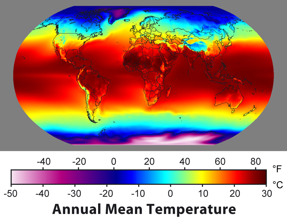
This map shows the variation in temperatures around the world. The smooth transition between colors helps the reader's eyes to move from one section of the world to another. The sharp jumps in color, such as in Europe, also emphasizes the drastic change in temperatures.
Tuesday, October 8, 2013
Choropleth Map
This is a great map that displays all the data that was collected, which I found interesting. The colors could be better, but I thought this was a unique choropleth map.


Tuesday, October 1, 2013

Tuesday, September 24, 2013

Thursday, September 19, 2013
Type Map

This map contains a variety of information about state capitals and cities that the author wishes to convey. With a crafty selection of text color, size and placement all of the information fits into each state. Although it appears cluttered in some parts of the country, the bold letters mixed with lighter colors help the eye to differentiate between the different text.
http://www.turkey-visit.com/images/united-states/usa-map.gif
www.turkey.com
Tuesday, September 17, 2013

Tuesday, September 10, 2013
Monday, September 9, 2013

Thursday, August 29, 2013
Percentage of World Population Using Solid Fuels
The reason I like this map is because of the use of colors to emphasize where the highest percentage of solid fuels are consumed. The red and yellow colors stand out on their own, but the absence of color for the countries that have a low percentage of consumption emphasize the areas that do have a high percentage of consumption. This draws the attention of the reader to the important areas of the map and is effective in creating a visual guide.


Subscribe to:
Comments (Atom)